The Challenge: Gidel had been in business for 25 years, but its home-made logo and woefully out-of-date website made the company look like a Mom & Pop shop. The unappetizing first impression created by its branding belied Gidel’s innovative technology and stellar reputation among its client base. Those qualities only became apparent during a conversation with Gidel employees, severely limiting the number of prospects Gidel could move through their sales pipeline.
Gidel
About This Project
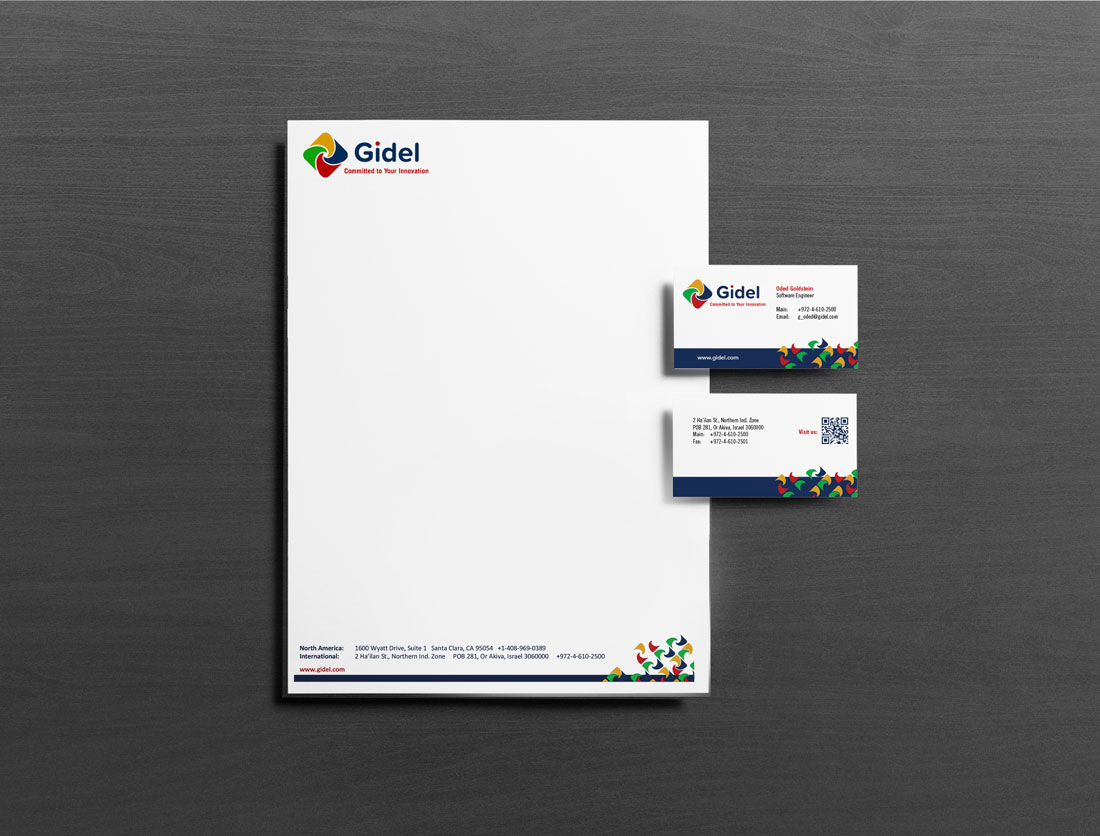
The Solution: We needed to give Gidel an entirely new look and create branding that combined the innovation and excitement of a high-tech company with the subconsciously corporate feel of a larger firm. Our logo redesign played off of the idea of a camera aperture and used the RGB color space, a nod to their specialization in the imaging and vision market. Gidel’s rebrand gave it a much more professional look and helped position the company as a leader in its field. The website now provides a polished first impression, and we are developing banner ads for Gidel’s first digital marketing campaign.
Gidel specializes in high performance computing solutions for the imaging and vision market, synthesizing and analyzing data collected from multiple cameras on autonomous cars and at professional sporting events, for example. Their original logo had been designed by the company founder 25 years ago, and our challenge was to create a professional image for the company as it entered new markets, starting with the logo and extending to a complete overhaul of their website and marketing materials. The logo played off of the idea of a camera aperture and utilized the basic RGB color space of broadcast, adding yellow as a fourth color.


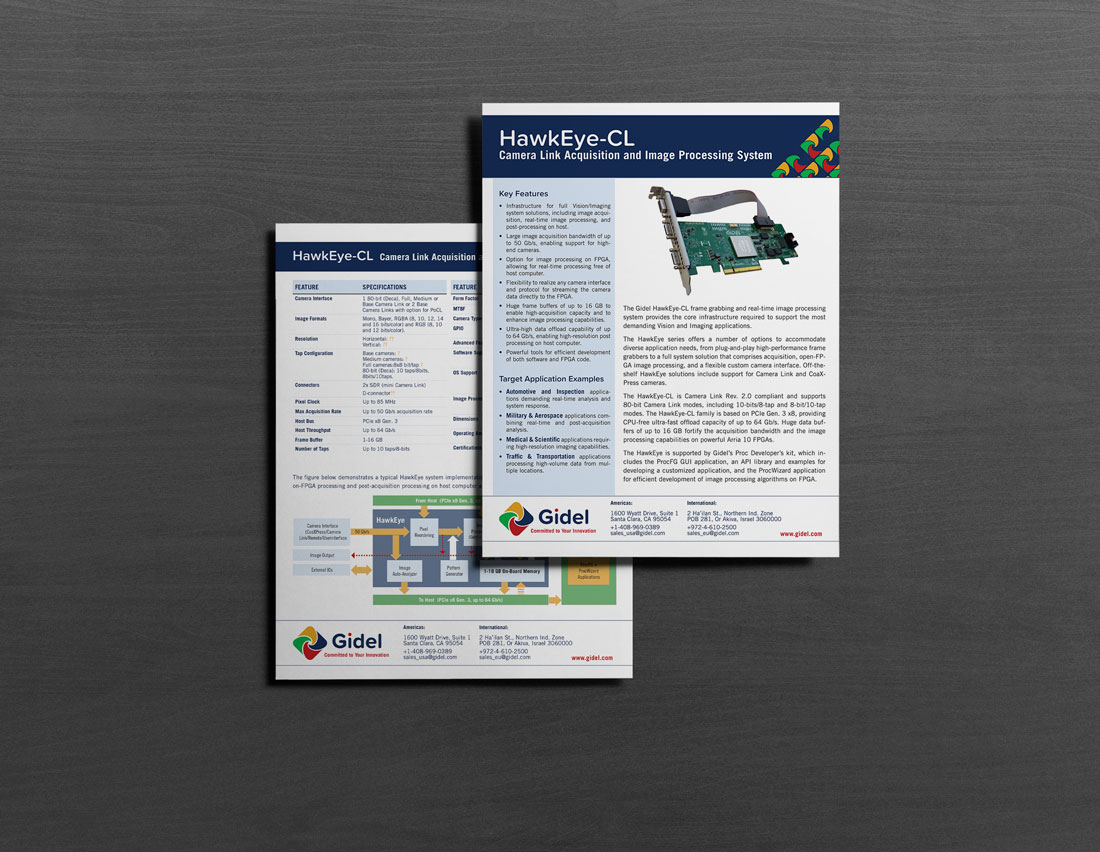
We then used the logo mark to create patterns – both a full color pattern that degrades, as well as tiled monochrome pattern – which Gidel could apply to their trade booth and marketing materials. We also created for Gidel a series of diagrams, as well as guidelines to be referred to as the company adds to their library of product diagrams.
After we completed their rebrand, Gidel could celebrate its 25th anniversary in style, looking every inch the part of the successful company that they are.


