The Challenge: Develop an identity to help a construction services company stand out in a crowded field of competitors.
The Solution: We created a logo which clearly identified the large scale infrastructure projects the firm works on, and developed a easy-to-update website which showcases their featured projects.
Merritt Construction Services provides consulting, project management, and construction services for some world-class projects, such as post 9/11 World Trade Center reconstruction, the Sharq Crossing in Doha, Qatar, and the surreal IT center at Florida Polytech. They came to us for a word-class logo design to match their client list. Our solution was a stylized bridge-and-tunnel graphic, evoking the major infrastructure projects Merrit works on, paired with simple typography and a distinctive dark blue and warm gray color palette. Since Merritt still uses on (gasp!) faxes for office communications, the logo had to work as black-and-white and greyscale variations.
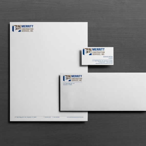
Merritt required a letterhead they could print from their desktop printer. We created a very simple stationery system so that the MS Word generated letterhead matched the high-end printed version.
For their website, we coded a portfolio showcasing their major projects. Their showcase projects are also spotlit on the website homepage, in flip boxes that present a view of the project, and flip to an introductory line of text and a link to each.


