


The Challenge: Assist a event software company to stand out in crowded trade shows.
The Solution: The pink circle element in the etouches logo provided a starting point for us to develop a wide range of brightly-colors, playful materials that were a departure from the company’s staid, muted competition.
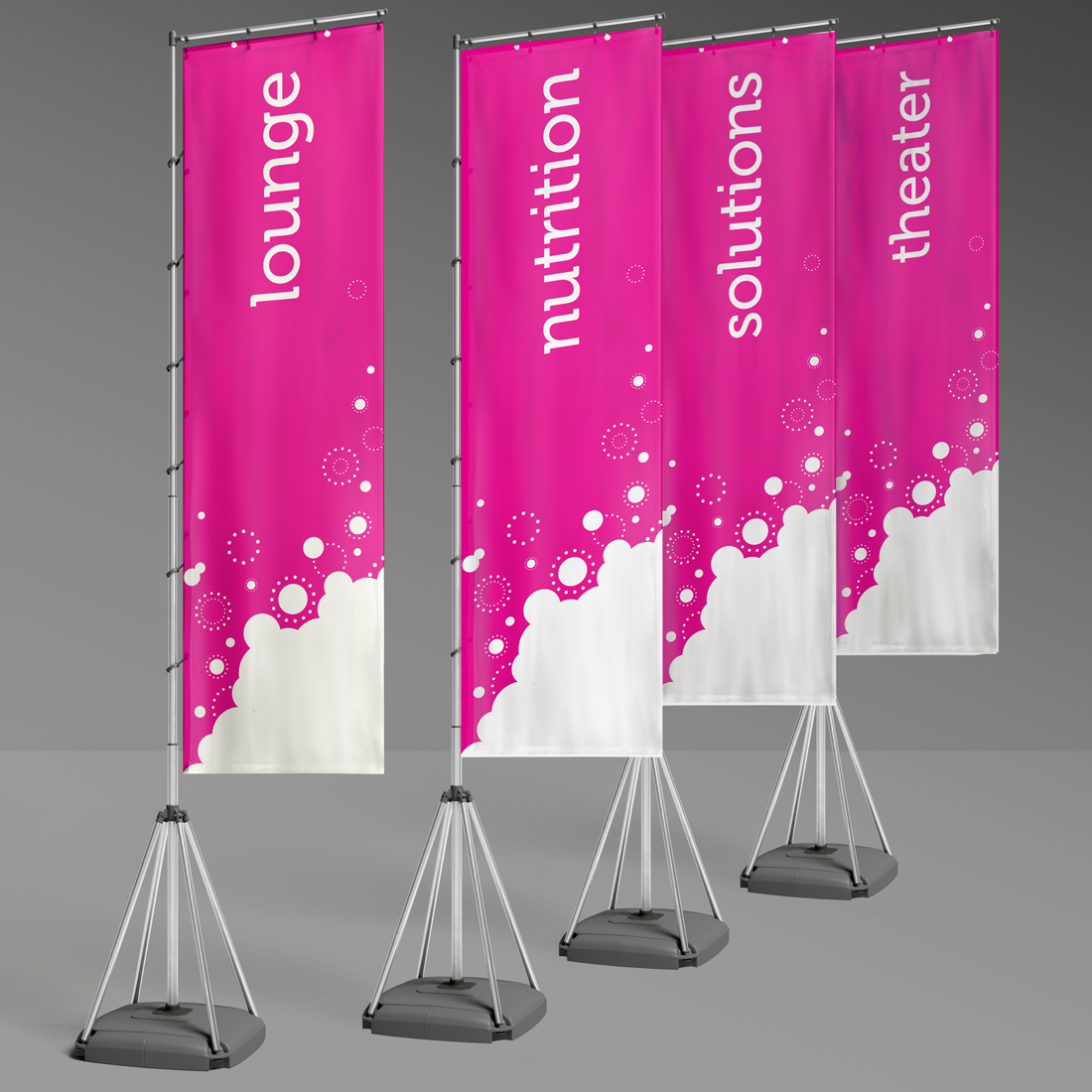
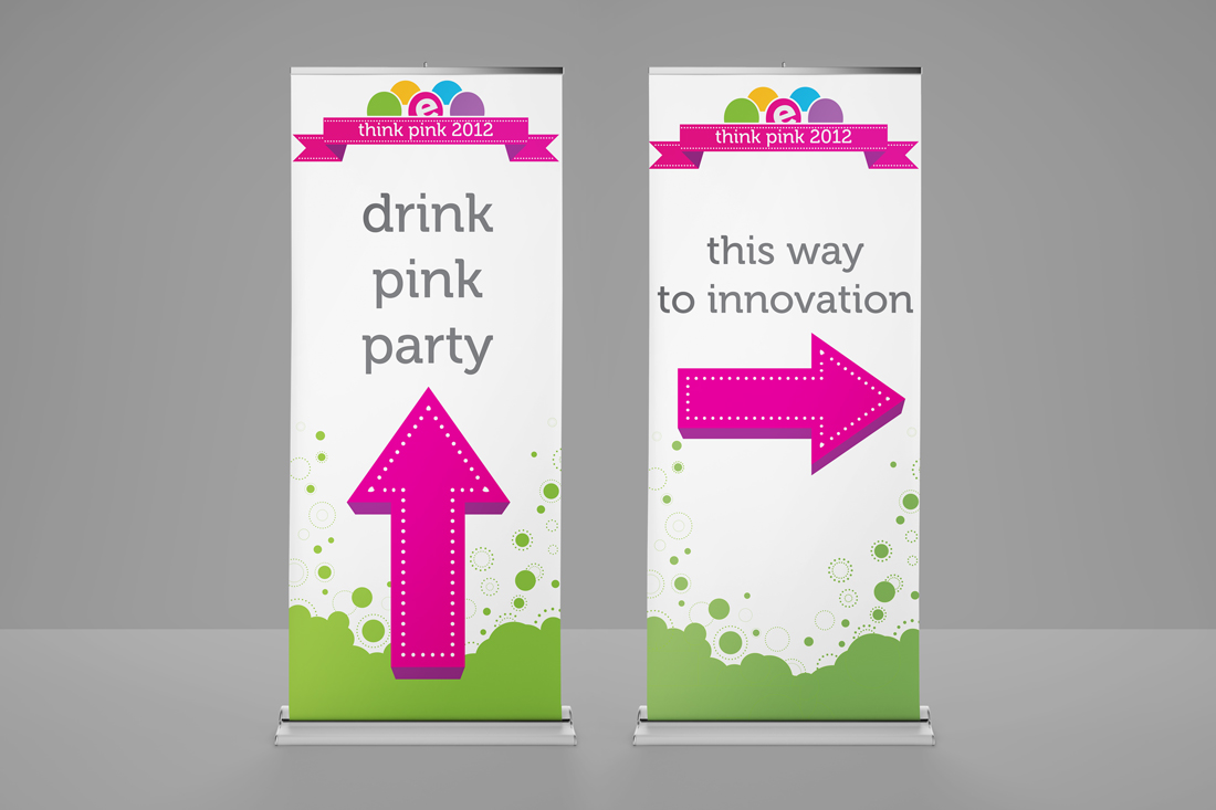
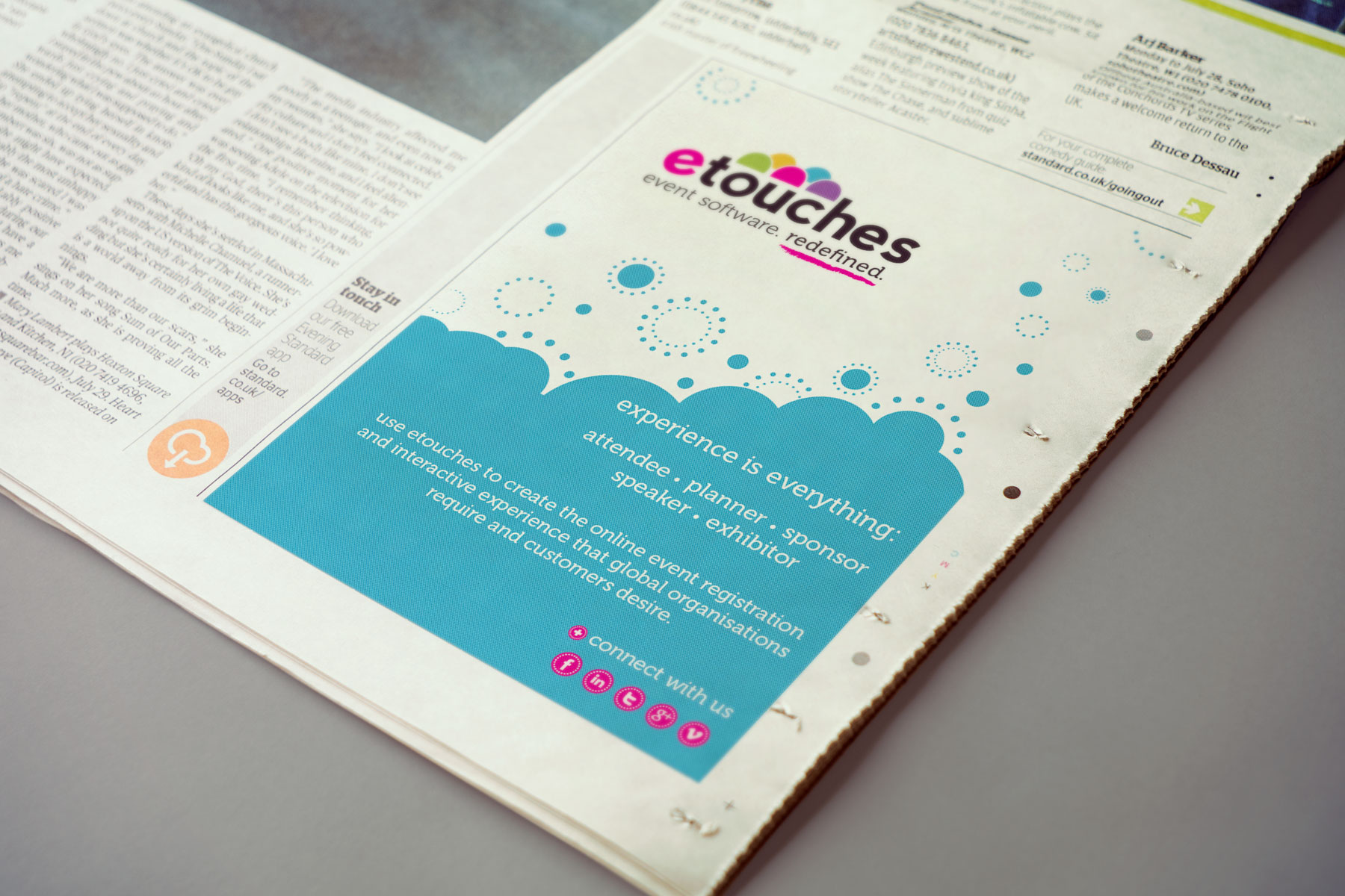
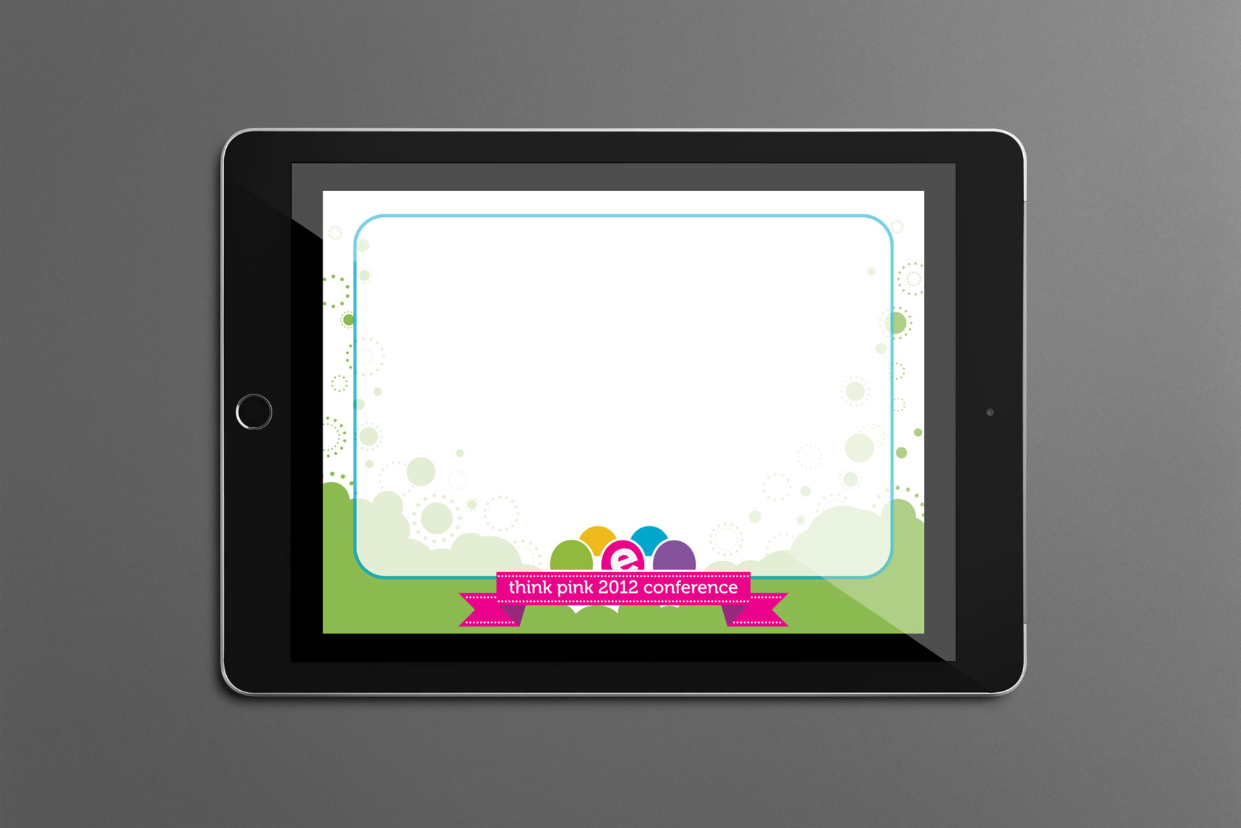
etouches is event management software that breaks boundaries, especially in its branding – fun, engaging, and exuberantly pink. We created a wide range of materials for etouches events and publicity, utilizing the company’s distinctive logo circles to create energetic patterns and product icons. The pattern was featured prominently on their “Think Pink” user conference materials: booth wall and backdrop, directional and location signage, PowerPoint template, and notebook give-away. The distinctive pattern was carried through in advertisements and trade show materials used throughout the year, revisited in etouches corporate colors. We even created a floor tile, used at one trade show to direct visitors to the etouches booth.
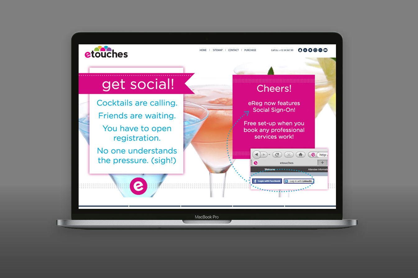
We also designed a wide range of materials, using etouches destinctive branding, including email headers and footers, homepage graphics, and product sales sheets. That latter featured a “lifecycle diagram”: a clear illustration of the interlocking etouches products, and where each can be used in the lifecycle of event planning.

