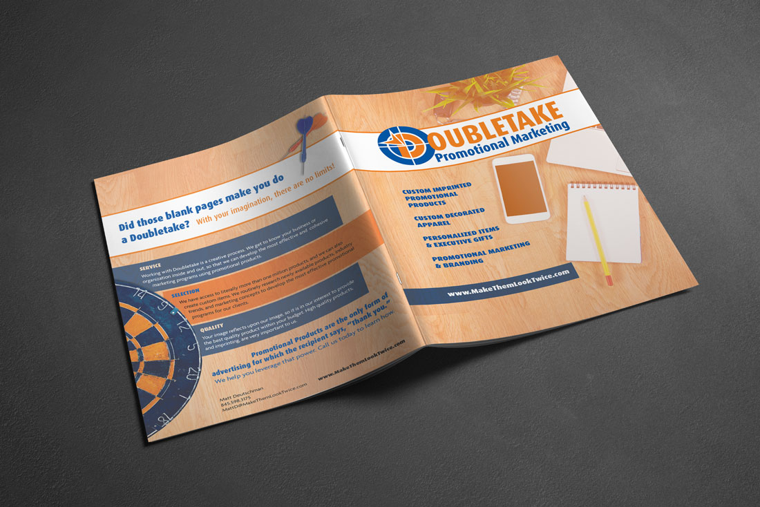
The Challenge: Create an identity which will elevate the company perception from that of promotional printer to a marketing partner.
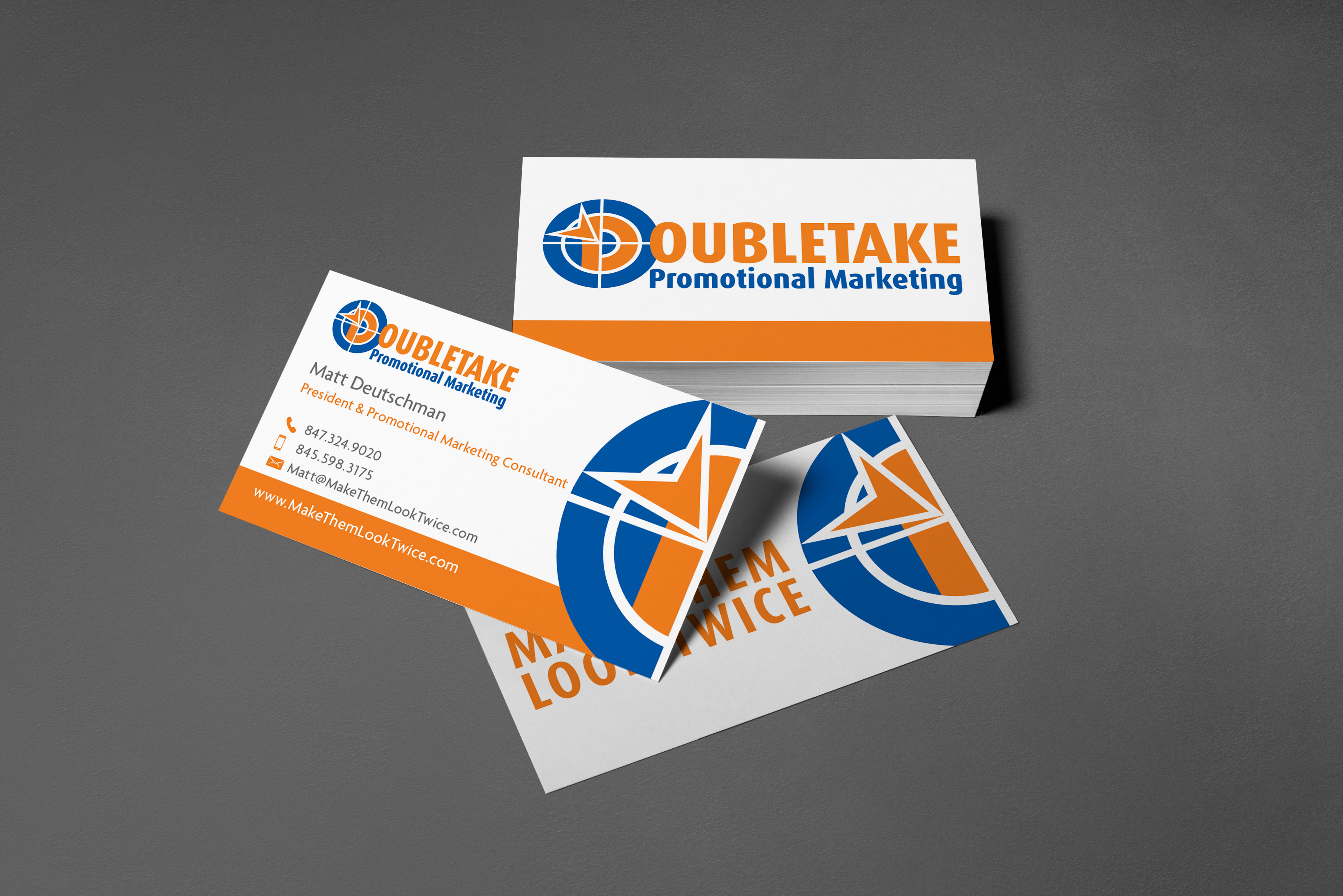
The Solution: We selected a rounded typeface for the company logotype, permitting us to nestle the capital letter “D” within an easily recognizable symbol of targeted marketing.
Doubletake Promotional Marketing wanted to convey their comprehensive approach to enhancing their clients’ marketing strategies with well conceived, innovative promotional items and campaigns. Initially we tackled their logo design with logotype treatments, but the results were too corporate, abstract, and formal. We ended up going back to a familiar marketing icon – a target – but worked it to include the company’s initial cap, with an arrow graphic that played off their competence with online promotional marketing.
We used the company’s tagline, “Make Them Look Twice,” as inspiration for their business cards. The cards are lenticular, permitting us to feature the company logo on the front, and reveal the tagline on the flip.
