The Challenge: Masala Bhangra is a high-energy, Bollywood-style fitness program – the first of its kind. But its website looked old and unprofessional, and was confusing to navigate and not user-friendly, so the franchise had a hard time attracting new trainers. The site needed to make it simpler for prospective trainers to learn how to become certified in Masala Bhangra, and for current trainers to list classes and attract students. To be more compelling to those prospective students, the site design needed a fresh look and the energy that would properly represent a lively fitness franchise. The client did not want to change their logo as it was in widespread use globally, and could not invest in new graphics, so that energy had to come from the new design itself.
Masala Bhangra
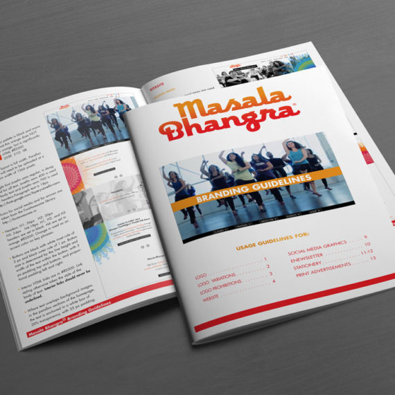
Branding guidelines
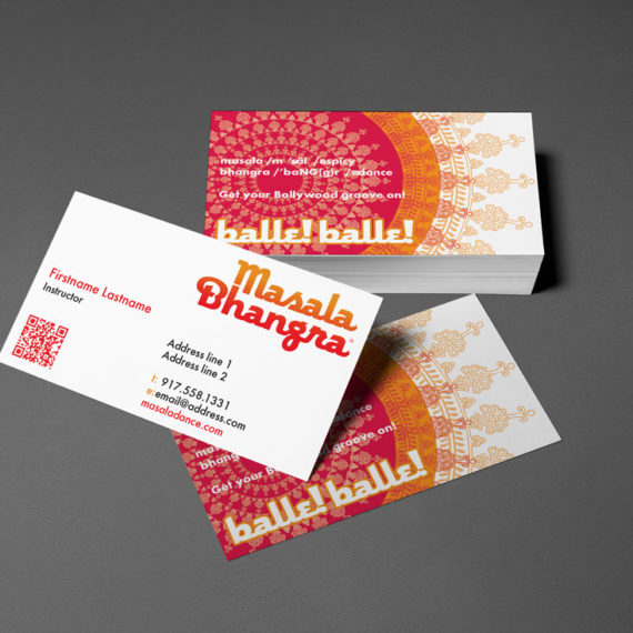
Business card template
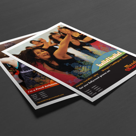
Trainer and club flyer templates
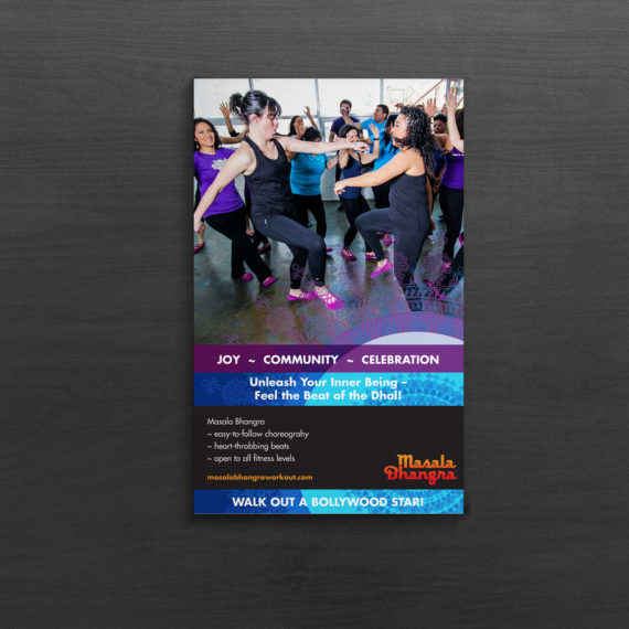
11×17″ club poster
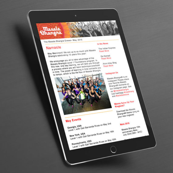
Enewsletter
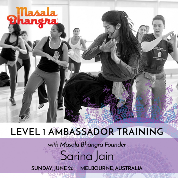
Facebook graphic
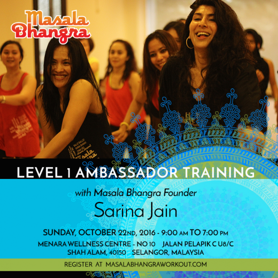
Facebook graphic
About This Project
The Solution: Utilizing Masala Bhangra’s existing logo, mandala graphics, and photography, we developed a comprehensive identity for a global fitness program. We appropriated the beautiful, vibrant mandala from the company’s DVD packaging because we felt it was the perfect symbol of the warm, exuberant Masala Bhangra community of trainers and fans. The completely revamped Masala Bhangra visual identity featured bold new colors and utilized that mandala as a design element across all of their marketing materials. Layered photos and contrasting mandala graphics became the basis for their new website and the templates we created for posters, flyers, a newsletter, advertising, and social media graphics. We then provided brand guidelines so that Masala Bhangra could maintain brand consistency across the globe.
The website we designed used full-width parallax sections of imagery that slid over one another as the user scrolled to create an inviting, distinctive web interface that conveyed the movement inherent in the company’s Bollywood roots. The site featured multiple levels of engagement: a store, class directory, event calendar, and galleries of press coverage and event photographs for students, and a login portal and back end for trainers that allowed them to update their profiles, post classes, and chat with each other via a forum. We worked with the Masala Bhangra’s back-end development team in India, providing them with layered Photoshop files and explicit instructions on how to implement the design. The team in return provided us feedback on feasibility and best practices.
The Outcome: Masala Bhangra’s trainers loved the new look and feel of the site, and the fact that it featured video, which could instantly convey what Masala Bhangra was to a new audience. They were pleased with how easy it was to utilize the site to access resources and schedule trainings. And Sarina Jain, the founder of Masala Bhangra, was able to show prospective trainers a more polished operation and how invested she was in the growth of her instructors by providing them a portal for conversation and community. The new site greatly reduced complaints from Sarina’s trainers, increased site traffic, boosted morale among current trainers, and became an attractive draw for new trainers.
The site we designed is now five years old, and Sarina just returned to re-engage Optimum for a site facelift that will spike interest in Masala Bhangra once again. She plans to add more content and social media integration this time around, working with a marketing consultant to drive traffic from her social media efforts. “I returned to Optimum for their valuable expertise and because they are a lot of fun to work with,” said Sarina. “Their passion and love for what they do is what attracted me back.” Stay tuned for the results of our continuing collaboration!


